作者:Heidi Su,美國紐約

照片:Green Tots Club 編輯群 (歡迎全文轉載,禁抄襲必究)
訂閱 【Green Tots讀報】
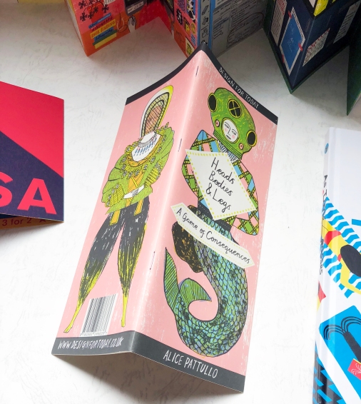
Heads, Bodies & Legs
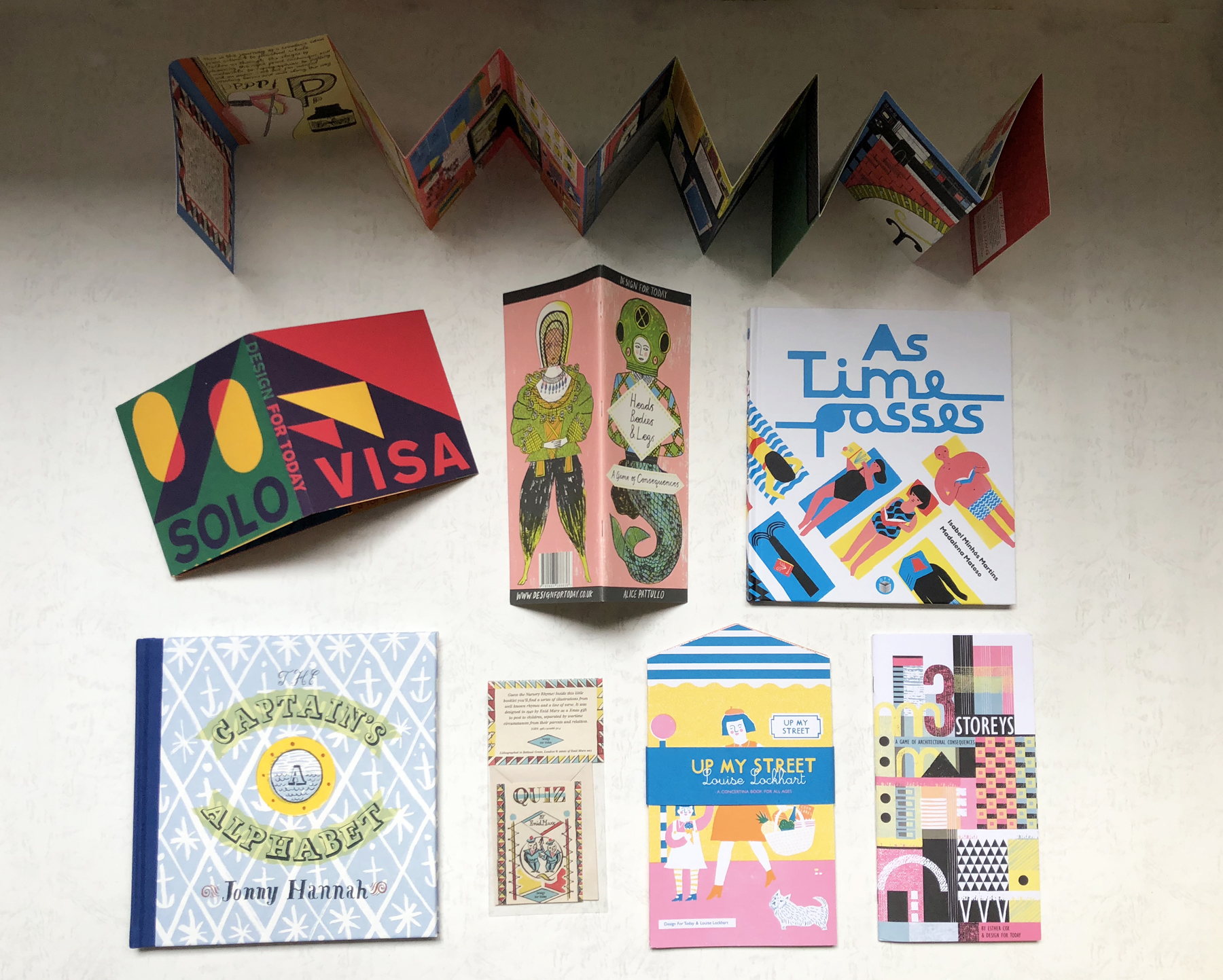
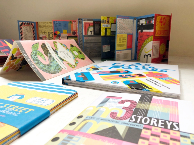
第一次接觸到DFT(Design For Today)出版的繪本是在英國參觀House of Illustration禮品區。當時參觀完Quentin Blake的原畫展。在禮品區隨意翻閱到一本從未在美國和台灣看過的小眾出版品繪本,書名為Heads, Bodies & Legs: A Game of Consequences ,覺得很有意思。
作者是來自英國的Alice Pattullo。這種將頁面裁減成三段式,讓讀者任意分段翻閱的繪本設計並不難見,但是我卻被她極富個人特色與仿古的插畫所深深吸引。書中有英國經典穿著、設置虛構的神話人物們,讓你隨意將他們的上、中、下身作排列組合玩變裝遊戲。
這種意象式的遊戲是許多藝術工作者常玩的遊戲,稱為Exquisite Corpses(中文有人翻譯為”隨機接龍”)。常常是在酒吧裡面大家小酌聚會到尾聲,話題有點乾掉時,所開始玩的遊戲:一人起頭先在紙上開始作畫,將畫的東西其中一部分摺起來,讓其他人延續露出的那一部分接著作畫,大夥輪流作畫,最後大家將紙打開看看變成甚麼怪物。聽起來好像很無聊,但是派對上一群人隨機接龍還是很有意思的。
Alice Pattullo以獨特的方式詮釋中世紀調性的插畫對於常看美式畫風的我來說很新奇。發現這種很”英倫風”的繪本當然是立馬放到我的購物車結帳收藏….當時我沒有特別留意這本書的出版社。
Up My Street
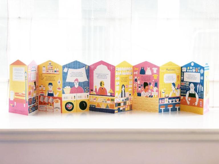
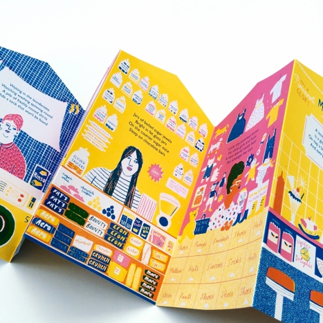
就在2年後的一天,我在網站上要找除了Alice Melvin詮釋關於舊時代英國High Street的街景繪本時,不經意發現下面這名為Up My Street的繪本。
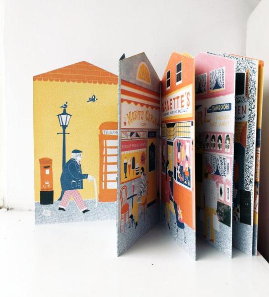
繪製這本展頁書(風琴書)的作者是Louise Lockhart,雖然兩位都來自英國對這個High Street的店家記憶當然有這這各自的個人特色,但是這本High Street街景以復古的印刷方式讓我想到早期電影中導演為了要讓觀眾了解目前在看的情節是倒述,常常將影片放暗或轉黑白的手法。
除此之外,展頁書展開讓你眼睛游移在這條街上的特色店面,反面則是出現每一家特色店家老闆與內部的陳設。很有巧思。
就在這本書被發現的同時,我也開始認識Design For Today這個奇特的出版社,以及這間獨立出版社發行的許多”英倫風”復古繪本…..
The Indie Publisher from England
Design For Today發行的每一本繪本都帶領讀者駐足於歷史的某一刻
Up My Street
隨著大型購物商場的崛起,這條街上曾經迷人的風景逐漸消失。本書將英國特色小店街聞名的High Street風貌記錄下來,讓這條曾經馳名國際的High Street能夠完美留存在你的書架上。
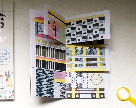
3 Storeys: A Game of Architectural Consequences
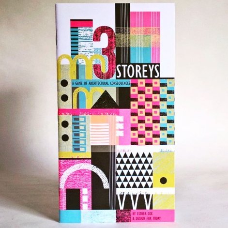
與前面介紹的Heads, Bodies & Legs一樣,這本書是以隨機接龍的型態呈現給讀者。但是內容卻帶領讀者欣賞16個英國近代的特色建築外觀。作者Esther Cox以英國藝術家John Piper作品為靈感,以織品的設計靈感Textile Design Process詮釋出意象式的建築外觀。
以書中一頁為例,介紹是Erno Goldfinger設計的Willow Road住宅。放上照片讓大家比一比….
對於端看建築外觀無法想像室內空間的朋友,我找到一張Willow Road內部的照片,穿透的光線不就是你我的夢想居家? 我覺得這本書是一個很棒的引介,隨書附贈的手冊提供詳細的建築物當年的設計背景,讓有興趣了解更多的讀者可以恣意在網上發現更多資訊。
As Time Passes.....
意外的發現一本葡萄牙插畫家Madalena Matoso的英文書。與出版社多以特殊形態發行繪本比起來,這本書就是顯得特別中規中矩。不過就是一本精裝,翻譯為英文的繪本….不過繪本的字裡行間充斥著Madalena擅長的禪意。
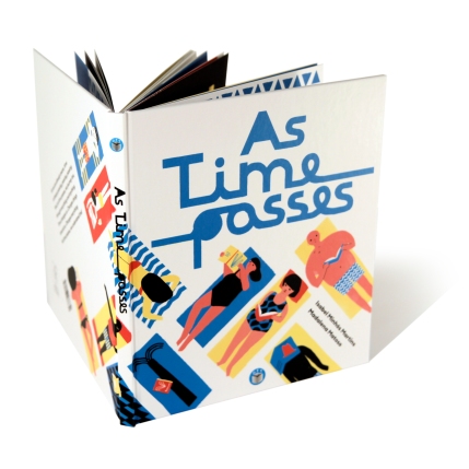
書中以對比的文字與充滿里斯本鮮明黃的插畫激盪讀者對人生的省思。我個人猜想Joe擠破頭皮和大型出版社買到這本書的英文版權,大概是這本書除了內容,光就書名As Time Passes就已經將他的出版社精神表達淋漓盡致。
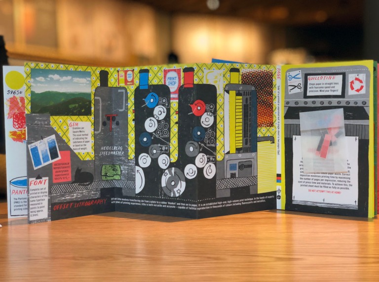
The Print Shop
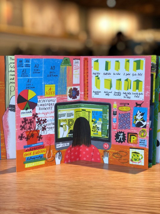
這本書又是Design For Today和Alice Pattullo的合作,慶祝Calverts Print成立40週年的展頁繪本。以14頁插畫呈現印刷品的製作過程:設計、規格確認、印前完稿、印刷、裝訂、包裝等。其中對於印刷技術,像是CMYK印刷原理、解析度、紙張選用、出血、模式有詳細的圖像說明。讓小朋友對於這些平日垂手可得的印刷品和書籍製作過程能夠有深刻的了解。
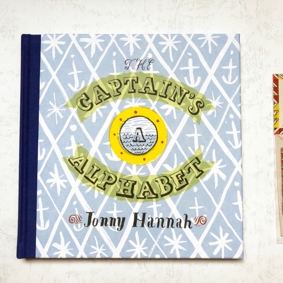
The Captain's Alphabet
還有英國頗具影響力的插畫人物Jonny Hannah,Joe將他過去繪製的海報集結成冊,發行成為The Captain’s Alphabet。讓喜愛Jonny Hannah的搖滾畫風的粉絲可以一次收藏他的作品。


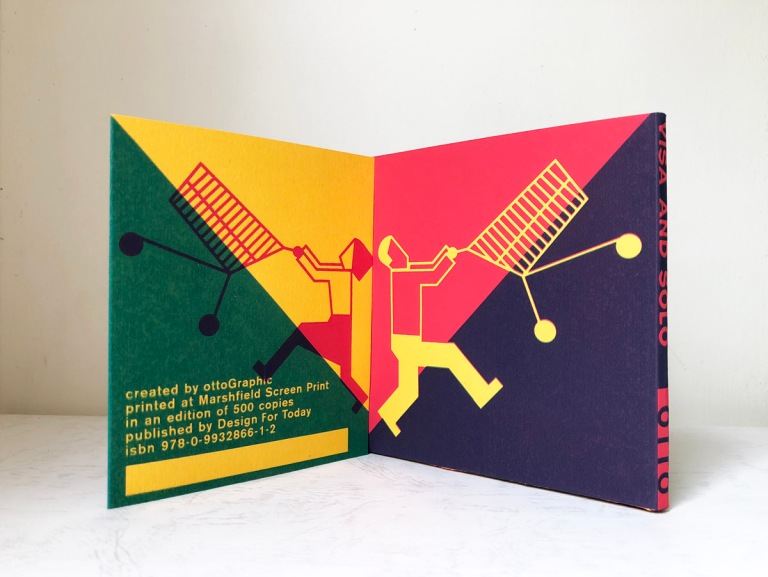
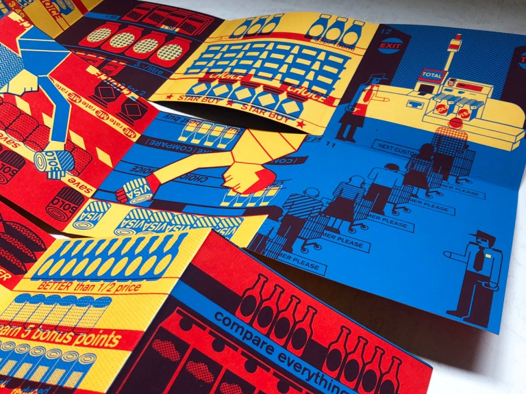
受東歐工業年代靈感所編版創作的Visa and Solo (限量書)
這本書編輯靈感來自蒙太奇拼貼剪輯,以圖像表達意識形態。 Visa and Solo 探討賣場行銷術和信用卡造成消費者性用擴張失序行為。因為個人工作背景的關係,我個人對於這種用繪本強烈圖示探討經濟行為的作品都特別的偏愛。
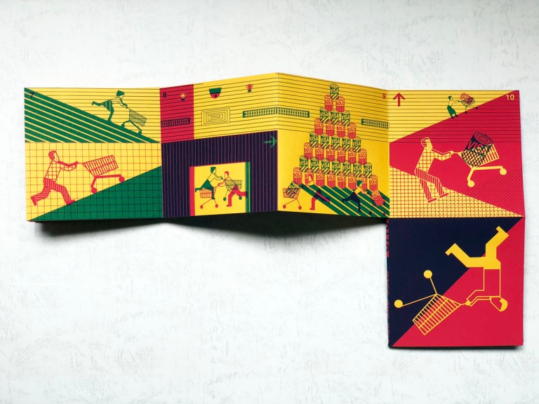
書一翻開便可以見到一男一女各自推著一台手推車 往兩個截然不同的方向前進 彷彿暗示男女對所欲消費商品的概念截然不同。
將書延展開….首先映入眼簾的就是排得像怪物般的購物車,有沒有感覺彷彿你開始步入大型商場?

- 照片來源:Green Tots Co.
接下來頁面中的商場架上出現 「買3算2」、「雙倍集點」 等行銷標語。繪本使用大量的正紅色和正黃色作為背景色, 這讓我聯想到每年耶誕節前夕,在曼哈頓街頭受到壅擠人潮簇擁下失心瘋似購買耶誕節禮物。在佳節一定要購物氣氛下,由原本的家人禮物、同事禮物、買到連失聯多年的小學同學的耶誕禮物都有了。 這種買到滿手的感覺和繪本中最後已孔雀藍為背景底色,以三聯頁上顯示出長龍的結帳隊伍。當這個孔雀藍的插畫映入眼簾,視覺突然感到一種如釋重負的快感。大概就是逛街買到感覺連平日都不常見面同學的禮物都準備了的感覺!
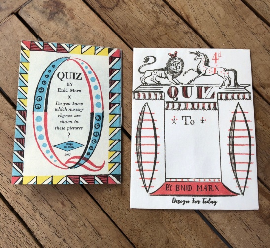
Quiz
還有一本超級迷你的複刻童謠小冊Quiz。這本小冊是Enid Marx在戰爭時的作品,因為戰爭期間的關係,他的作品非常的少,再加上這本小冊非常的迷你。讓他更顯稀有。Design For Today使用那個年代生產技術製作出的紙質,並且很有緣份的同樣在東倫敦印刷。讓這本珍稀小冊再次廣泛的出現在2018的讀者收中。


不要忘記小冊名為Quiz(小考),書頁的最後一頁出現一個問題,並且附上一個迷你信封,讓你將這個小考輕易地寄到世界各地,考考你的文青朋友。
在今年下半年這家走在時代”後端”的出版社即將與Alex Barrow以繪畫記錄手風琴樂器史的限量繪本The Squeeze Book (限量書)。是的!你沒看錯,是以展頁書(又稱手風琴書)的方式記錄世界各個角落的手風琴樂器,全書展開將近2公尺。豪氣地展現這個樂器受世界各處矚目的原因。

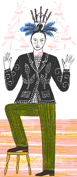
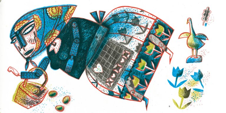
除了The Squeeze Book即將於6月發行的書以外,下面這本是Joe和Clive Hicks-Jenkins合作的繪本,是我個人非常期待的繪本。該書文字是Simon Armitage源自格林童話故事Hensel and Gretel靈感但是改編為現代時下的詩句,插畫則很跳tone的使用Clive Hicks-Jenkins以格林童話Hensel and Gretel故事所創作的插畫攪和一起出來的繪本。目前出版社官方僅露出下面這張插畫….
怎麼樣?你怎麼可能會要錯過?為了這本書,我們特地在盛夏來臨舉辦一場為期5天的瘋團購活動。快來跟’瘋”Design For Today的繪本囉!
與出版社老闆Joe的對話
出版社對於自我的期許一般是走在時代前端,對於這家英國獨立出版社出版的繪本都是在對過往某一個年代致意,在我眼中看來好像是堅持著走在時代的”後端”,令我充滿好奇,但是礙於Design for Today出版社位於飛機8小時的大西洋另一端以及我個人迫切的求知慾。我請Joe做了一段簡短的訪問,解開對這家出版社的好奇疑問…..
Q&A with Joe, owner of Design of Today
1. Why your publishing books most limited edition?
I like the idea of my books having a fixed edition so that they are more collectable. Once they are gone, they are gone. I think that helps to make them more special.
2. For those books already sold out, any chance we will see them reissue? There is publisher called TARA based in India. They published limited editions as well but lately reissue them with different covers. Will you consider doing so? Or you tend to move on to next project and want your readers keep the limited editions as treasure.
So no, once my books are sold out that’s it. There could be a time when other publishers might want to republish these and I’d be very happy with that, as then they could see another life.
3. How do you take new project? How do you make final call about book format? I notice only As Time Passes and The Captain Alphabet come with normal picture book format, hardcover and thick pages. Why do these two books different than others you published?
I try to vary the format of each book, some in concertina format. Others hardback, some small miniature books, others coming soon in large folio size. I try to discuss with the illustrators which format will suit the content, and styles of printing and binding.
4. For book ” The Print Shop” particularly, why will you want to publish a book most like store catalog or tutorial? No offense. It is very fun book for me but just out of curiosity.
The idea for the Print Shop came in talking to the printer Calverts, who were approaching their 40th Anniversary. There are examples of printers in the 1930s and 40s, such as The Curwen Press, who produced keepsakes for their customers and bookshops that showed off what they could do. We thought it might be a nice idea to show how a book is made and how Calverts work with illustrators and designers. Calverts subsidised the book so that it was possible to publish this at a reduced price so that lots of students could afford this too.
5. If you want to use a few words introduce our readers in Asia about “Design For Today“, what will you say?
Design for Today is all about bringing the joy of printing and illustration to an audience who enjoy playing with printed objects. It’s also about bringing something that isn’t found on every high street, something special and unique. It’s also about being affordable, somewhere between Artists Books of a handful of copies and mass publishing in the thousands. Books to touch as well as read. Many of our books look as though they are children books, but they are also books to be enjoyed by adults too.
6. Is your studio open for public?
I work from home, but I do have people who email and come round for a chat, or visit.
7. What is your philosophy helping to decide books to be published?
The books or projects have to be fun and interesting. I avoid the usual content of children’s books, so no pink fairies or cuddly animal stories. I like books that have layers of interest, sometimes ones that tell alternative stories. The quality of illustration is very important and I tend to work with illustrators who draw, using traditional pen, ink, pencil rather than using digital drawing tools.
